The interaction of the colours with their surroundings is truly fascinating
These new options are an incredibly rich toolbox for the creative mind
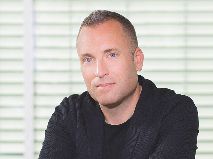
Michael Seum - Vice president design
At GROHE, Michael Seum is responsible for insight- driven designs that capture the spirit and imagination of designers throughout the world. With GROHE SPA Colours, he and his team created a powerful palette of longlasting, high quality colours that harmonise with every project.
What role do colours play in your work?
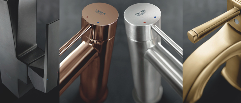
Michael Seum: Colour is incredibly important. Having said that, If you ask ten people about their opinion of colours you get 15 different answers. We all respond to colour differently. In the kitchen and bath - when somebody makes an investment in colour, it’s not like wall paint, where that can be changed quickly. So our approach to colour, finish and materials is to ensure relevance in the home for many years to come – this is what we call design permanence. The GROHE SPA Colours have been carefully curated to ensure our customers have a rich toolbox and most importantly the freedom to create their desired vision.
Where do you get your inspiration from when you create a finish?
Michael Seum: The team and I attend major design fairs globally, for example the ICFF in New York, Maison&Objet in Paris, the Tokyo and London design weeks and Salone del Mobile in Milan. So we definitely get our inspiration from the cutting edge of the design world.
When we’re at these design fairs, we’re not looking specifically at our industry. We look at movements within the home sector, like the furniture industry. And then we’re responding to that with this selection of colours and finishes. With our range of colours, we want consumers to see that they have unlimited design flexibility with our collection. There’s a lot in the industry where they just pick up on a trend but fads and fashion just disappear. Even the quality is poor. At GROHE, we have a more balanced approach. When you buy a GROHE product it’s about quality, technology, sustainability and design. You know this colour and finish is on the cutting edge of interior trends and at the same time it will last, due to our higher quality standards.
What differentiates the GROHE SPA Colours from colour, as we typically perceive it?
Michael Seum: We could have gone after colours that were not such long-standing trends. They might be around for one or two years. But the problem there is when you’re working with bath interiors, these are fixtures - once installed they are there for a long period of time. We have to be really selective around the appropriateness of the colour and how it’s used. And I think there are other areas, where if you wanted to bring colour into the bathroom, you can do that - with lighting as well. That’s why we’ve taken an approach where the colour is a long-standing trend. And we’ve seen the warm finishes now year after year, in Milan and London. It’s now an accepted colour and finish strategy. But it’s not to say that we won’t have more unique finishes coming up during the process of developing the next generation of colours.
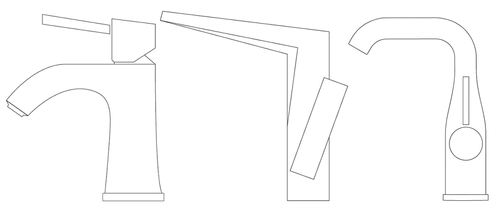
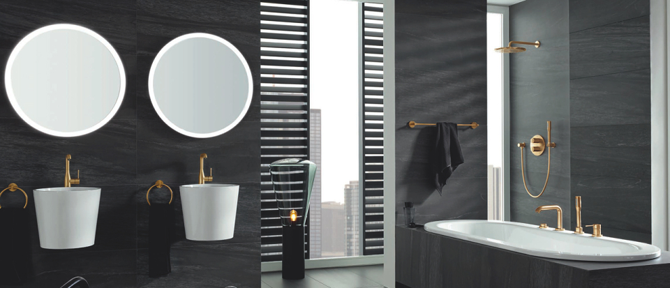
Inspired form meets inspiring colour